Climate and weather.
What is a Synoptic weather map?
A synoptic weather map is simply a map like you
see on the tv or websites about weather, where
lines show the weather.
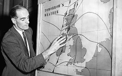
These days, it's all computer generated but in the olden days of tv, a man actually came along and stuck the lines on a physical map on a board.
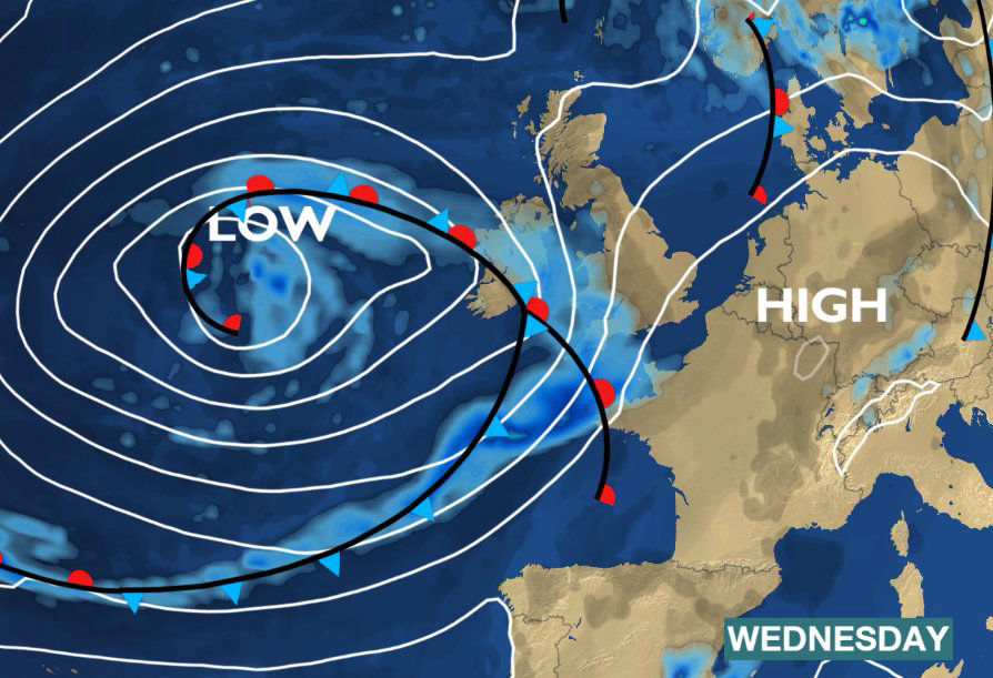
Of course synoptic weather maps are what we see today, and it can even look like the weatherperson is in the place on the screen.
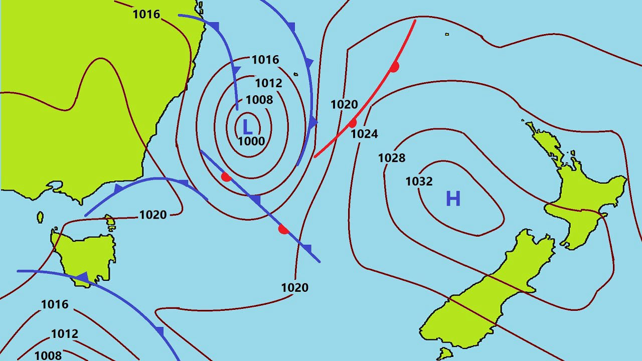
This is a fairly simple synoptic weather map.
We'll learn a bit about what all the lines and
numbers mean.
If you look at the map you will see that there
are lines in vague circle shapes
They are not, and never will be, exact circles,
but they are 'circular'.
All those lines join at some point, even if
it's of the actual map you're looking at.
Somewhere, the 1020 line which passes through
the middle of the picture will join up with
itself.
Who can tell me which two countries are
shown on that map?
It is indeed Australia and New Zealand. So this
synoptic map shows a weather pattern between the
two countries. That much is obvious.
But what does it mean?
Let's look at the lines first.
If you look out of the window, you can't,
hopefully, see lines in the sky like a synoptic
map.
The lines on a synoptic map show linked areas of air pressure. All the lines link areas which have the same air pressure. L stands for LOW pressure areas and H stands for HIGH pressure areas.
Here, you can see areas of Low pressure and High pressure.
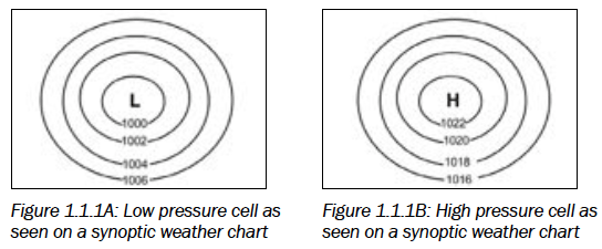
Note that the pressure reading decreases towards the centre of a Low and increases towards the centre of a High.
Obviously, in a Low pressure areas, the numbers get LOWER and in a High pressure area the numbers get HIGHER.
Each of the areas, concentrated around the smallest ring, is called a 'cell'. Fully, we call them 'weather cells'. The actual lines are called 'isobars'.
That's the basics of the lines.
But what about the numbers?
The numbers show air pressure above sea level.
Does air weigh anything?
Actually air really does weigh something. It's
not a lot but it can be measured.
Air pressure measures the weight of air pressing on the earth, or us or an aircraft - or, in this context, the air pressure is how 'heavy' the air is, in concentration, over a particular area.
The pressure is measured in hectopascals (hpa)/millibars (mb). The weight is tiny, and that's why the second one - millibars - has milli at the beginning of it.
And that's what the numbers show us.
To sum up so far:
• These lines join points of equal pressure
(all along one isobar the pressure is the
same).
• The pressure is measured in hectopascals
(hpa)/millibars (mb).
• The isobars form patterns (shapes formed by
many isobars).
And you can see each of those on the
coloured picture.
But what's the point of a synoptic weather
map?
A synoptic weather map shows weather conditions
and phenomena (temperature, precipitation, wind
speed and direction, atmospheric pressure and
cloud coverage) over a wide area at a given time
based on worldwide observations recorded at the
same time (from weather stations, airplanes,
weather balloons and satellites).
The reason weathermen make these maps is to show their best guess at the weather systems over a wide area. Not just over a city, but over, for example, central Thailand.
So why is it important to make these maps?
The answer is to predict - to predict both
favourable and unfavourable changes in the
weather.
Why is that that important when it's not over
land?
For boats, shipping and for predicting cyclones
or typhoons and other bad weather - or even good
weather.
If we think that these maps show air
pressure at or above sea level, what else
can be affected?
Aircraft - both passenger and cargo need to
know the weather.
Use Line, Facebook, email or IG
